Wordmark, Badge, Mascot, or Icon? How to Choose the Right Logo Layout
Compare the 5 essential logo layouts—Icon + Name, Wordmark, Badge, Letter Mark, and Mascot—with real AI-drawn examples and practical advice on where each layout works best.
 Pepper
 Kettle & Crumb
 Pawsome
When founders sit down to design a logo, they usually think about colors and symbols first. Should it be navy blue or forest green? Should it feature a mountain peak or a compass?
Yet in day-to-day use, your logo's layout—its structural shape and the relationship between your business name and symbol—matters just as much as what the icon depicts. A circular badge that looks incredible stamped onto a coffee bag can become almost illegible when shrunk into a 40-pixel website navbar. Conversely, a wide, delicate wordmark that shines at the top of an online store can feel awkward inside a square mobile app icon.
Here is a practical breakdown of the five core logo layouts you can draw on ai-logo.net, complete with real AI-drawn examples and how to decide which structure fits your brand best.
1. Icon + Name (Combination Mark)
An Icon + Name layout (often called a combination mark by designers) pairs a standalone graphic symbol with your business name—positioned either above the text in a vertical stack or beside it in a horizontal lockup.
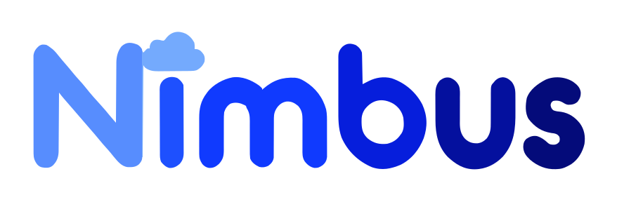
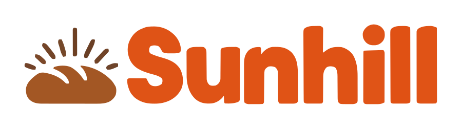
Why it works so well for new brands: When your company is brand new, customers don't know your name yet. Pairing a clear visual cue with readable lettering lets the icon communicate your industry at a glance while the text builds name recognition. Better still, inside the logo editor, you can easily separate the icon to use on its own as a browser favicon or social avatar.
2. Wordmark (Logotype)
A Wordmark puts 100% of the focus on your company name, turning the letters themselves into the artwork. On ai-logo.net, wordmarks aren't just plain typed fonts—our AI often weaves a subtle visual twist directly into one of the letters or punctuation marks.
When to choose a wordmark: Pick a wordmark when your business name is short, distinctive, and memorable (one or two words work best), or when you want a sleek, editorial look that never feels cluttered in website headers, clothing tags, or product labels.
3. Badge (Emblem & Crest)
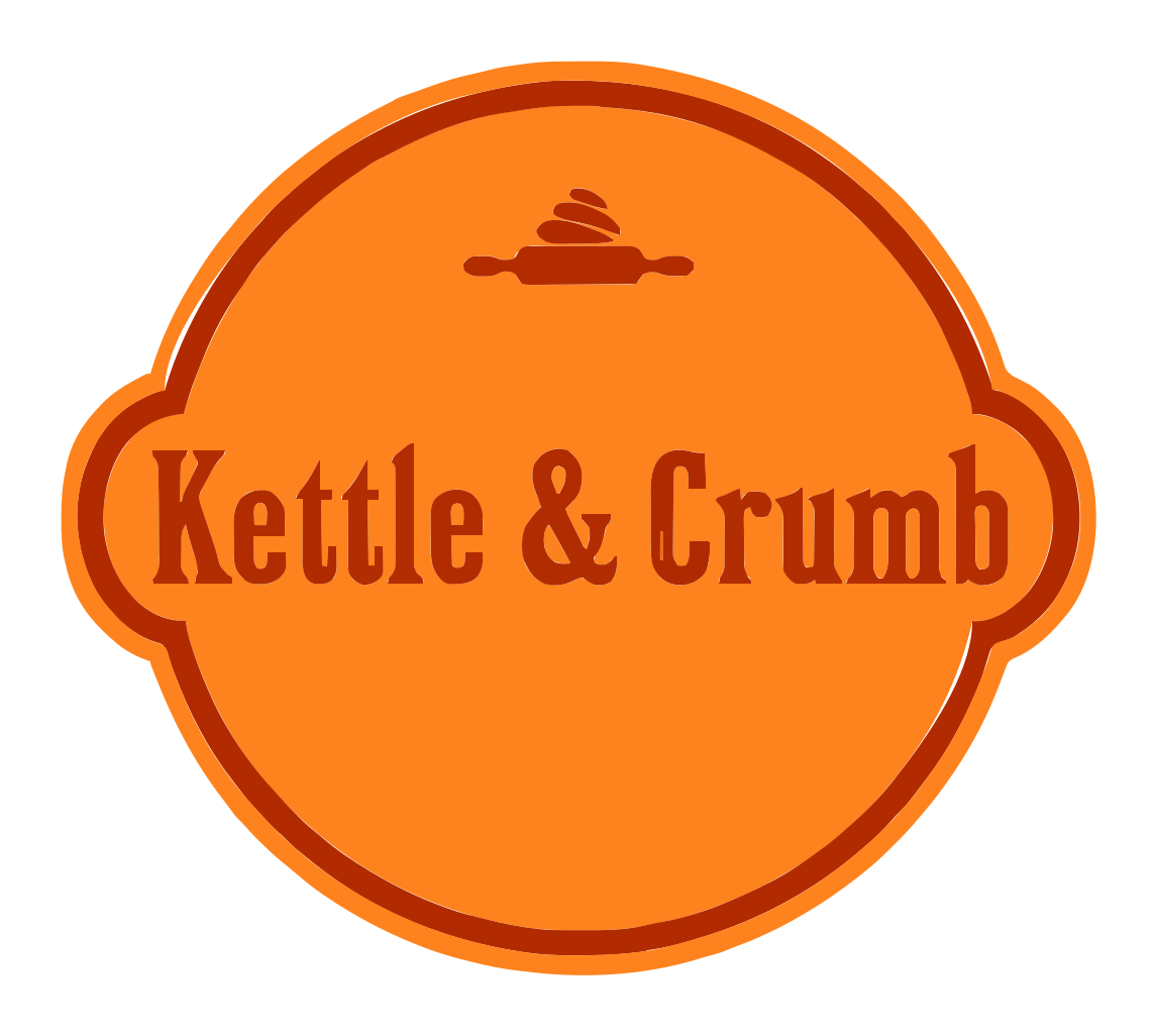
A Badge encloses both your business name and your icon inside a unified geometric frame—such as a circle, shield, pill, hexagon, or vintage stamp.
When to choose a badge: Badges carry an instant sense of heritage, craft, and permanence. They are a natural fit for coffee roasters, breweries, bakeries, barbershops, surf & outdoor gear brands, and sports clubs—anywhere your logo will be printed on cups, labels, patches, or merchandise.
Because a badge has to fit the entire name inside a fixed shape, names longer than 18–20 characters can force the lettering to shrink. If your business has a three-word name, try dropping the legal suffix (e.g., use "Saltline" instead of "Saltline Surfboards LLC") so the letters stay bold and readable.
4. Letter Mark (Monogram)
A Letter Mark anchors your logo around a stylized initial—either a standalone monogram paired with your full name or a bold initial sculpted into a visual symbol.
When to choose a letter mark: Ideal for law firms, financial advisors, architecture practices, and software apps where you want a clean, unmistakable shorthand icon that fits effortlessly inside square app icons and circular social profiles.
5. Mascot (Character Logo)
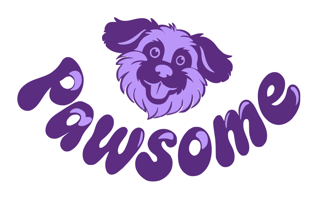
A Mascot centers your brand around an illustrated character—an animal, figure, or playful personified object with expression and personality.
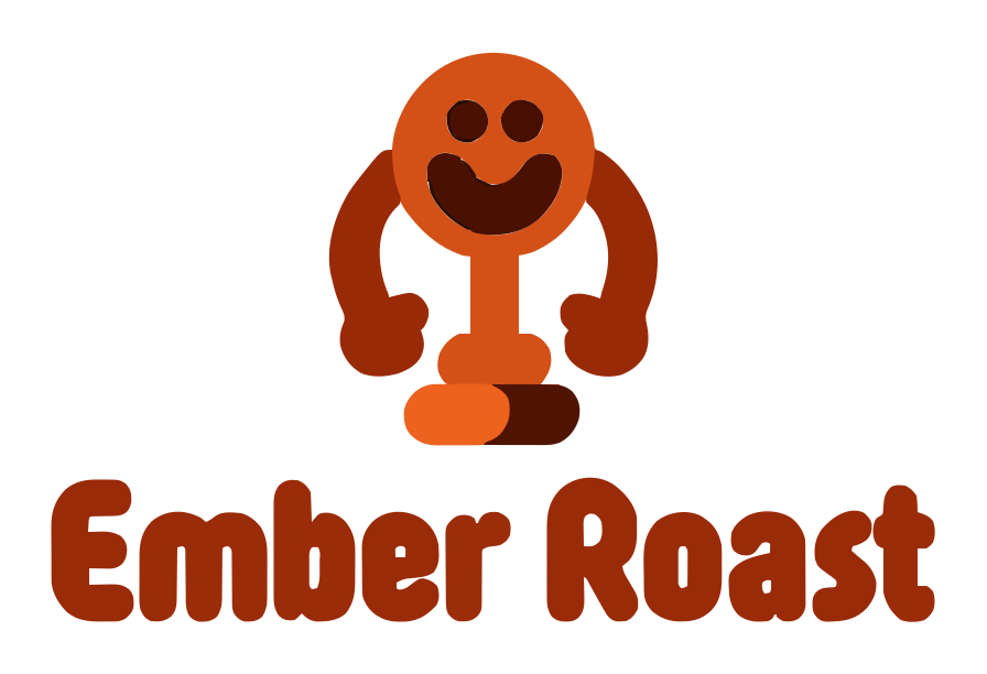
When to choose a mascot: Mascots build instant warmth and memorability. They shine for pet businesses, food trucks, ice cream shops, family clinics, daycares, gaming channels, and community sports teams.
Quick comparison: Which logo layout fits your business?
| Layout Type | Best For | Small-Size Legibility | Top Use Cases |
|---|---|---|---|
| Icon + Name | Almost any new business or startup | High (icon can detach for favicons) | Websites, signage, business cards, apps |
| Wordmark | Short, distinctive 1–2 word names | Medium (needs horizontal space) | Website headers, fashion tags, editorial brands |
| Badge | Food, coffee, breweries, outdoor & craft brands | Medium (best at medium-to-large sizes) | Packaging stamps, coffee cups, stickers, t-shirts |
| Letter Mark | Professional services, long names, mobile apps | Very high (monogram scales down cleanly) | App icons, favicons, stationery, embossing |
| Mascot | Pet care, hospitality, gaming, family brands | Medium (bold silhouettes work best) | Merchandise, social media, storefront signs |
Still torn between two directions? Start on ai-logo.net/make with Mix it up enabled. Seeing your actual business name rendered as a wordmark, a badge, and an icon lockup side by side usually makes the right choice obvious within seconds.