From Logo to Brand Identity: Launching Across Web, Packaging & Social Media
What to do after you finalize your logo: setting up favicons, social media avatars, dark-mode variants, print-ready packaging & apparel files, and a brand style guide.
 Sunhill
 Tidewater
 Northpoint
Downloading your finished logo is a milestone—but a single logo file sitting in your Downloads folder isn't a brand identity yet.
The real magic happens when that mark shows up consistently everywhere a customer meets you: in the tiny 32-pixel tab of their browser, inside a circular Instagram profile photo, at the top of an invoice, and printed onto a takeaway bag or t-shirt.
Here is a practical playbook for rolling out your new AI-drawn logo across web, social media, and physical products without losing visual consistency.
1. Set up two lockups: Your primary mark and your shorthand icon
One logo file rarely fits every container. A wide horizontal lockup looks right at home in a desktop website header, where vertical space is tight and horizontal space is generous. Put that exact same wide file inside a square app icon or a 40-pixel mobile avatar, however, and the text shrinks to an unreadable speck.
That's why professional brand systems rely on two coordinated versions of the same design:
- Your Primary Lockup (Icon + Name or Wordmark): Used wherever you have room to introduce your full brand name—website headers, storefront signage, packaging fronts, and slide decks.
- Your Shorthand Mark (Icon-only or Monogram): Used in tight square or circular spaces—browser favicons, mobile home-screen icons, social media avatars, and wax seals or stickers.
Inside the ai-logo.net editor, you can switch any Icon + Name concept to an Icon only layout or grab pre-cropped favicons and app icons directly from the Brand kit download pack.
2. Nail your website header, favicon & CSS color tokens
When adding your logo to your website, follow three simple engineering practices so it loads fast and looks sharp on every screen:
- Use the cutout
.svgfile in your navbar: Give the<img>or inline<svg>an explicit height (usually28pxto40pxon desktop) so the browser reserves space before painting and prevents layout shift. - Install the full favicon set: Modern browsers and phones look for an SVG favicon (
favicon.svg), classic PNG fallbacks (32×32,16×16), and anapple-touch-icon.png(180×180). - Pull your button and link colors straight from your logo: Use your logo's primary hex color for main call-to-action buttons and its soft tint for callout backgrounds so your site immediately feels custom-designed around your mark.
3. Avoid cropped text on social media profiles
Instagram, TikTok, LinkedIn, YouTube, and X all crop profile pictures into a circle (or a rounded square) with zero warning. If you upload an unpadded logo image that touches the edges of its canvas, the platform's circular mask will slice right through the first and last letters of your business name.
Always leave at least 20% breathing room between the outer edges of your logo and the edge of a square profile image—or let our Brand kit generate pre-padded profile pictures and cover banners already sized for every major social platform.
4. Test on physical surfaces before sending to print
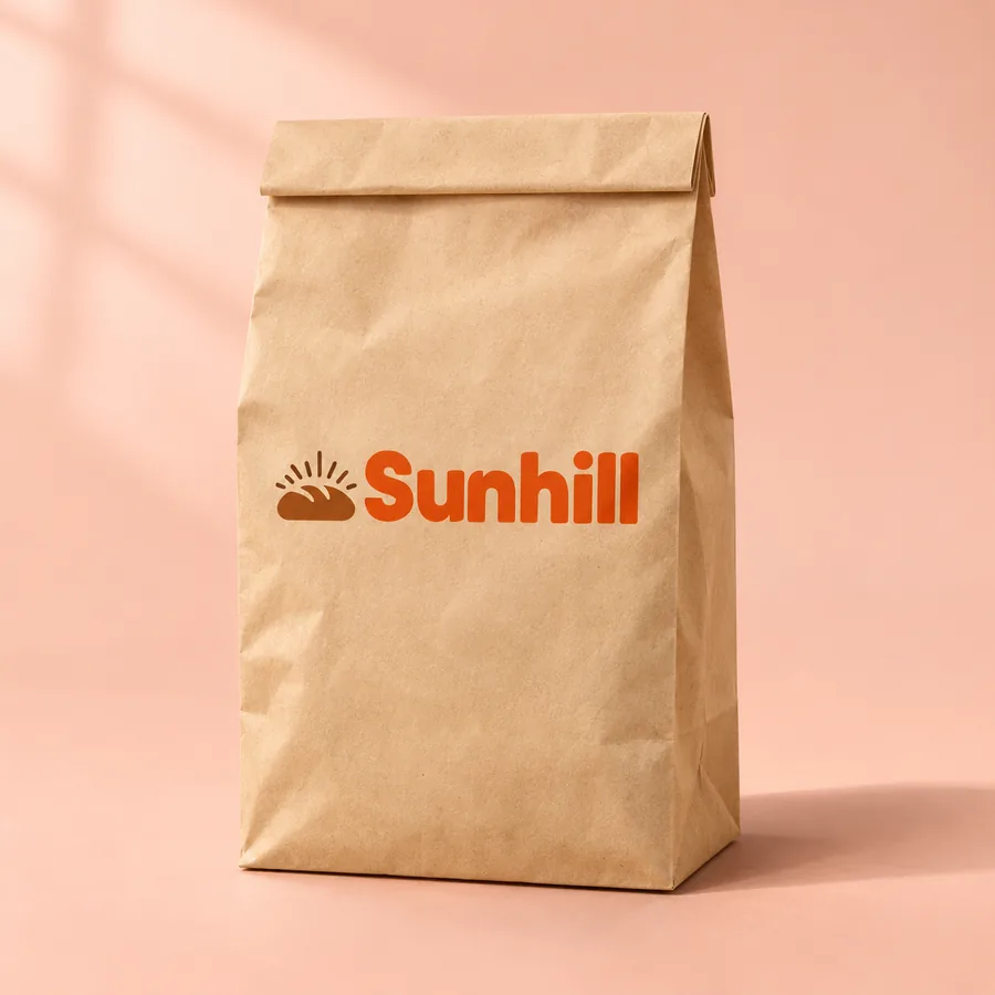
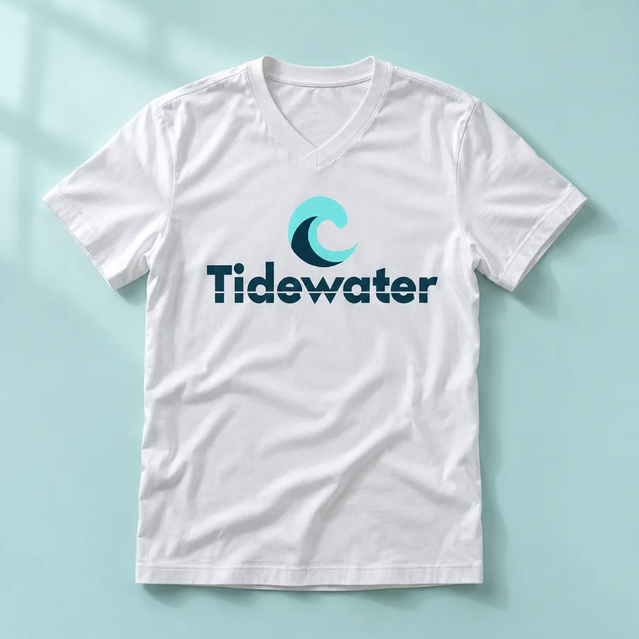
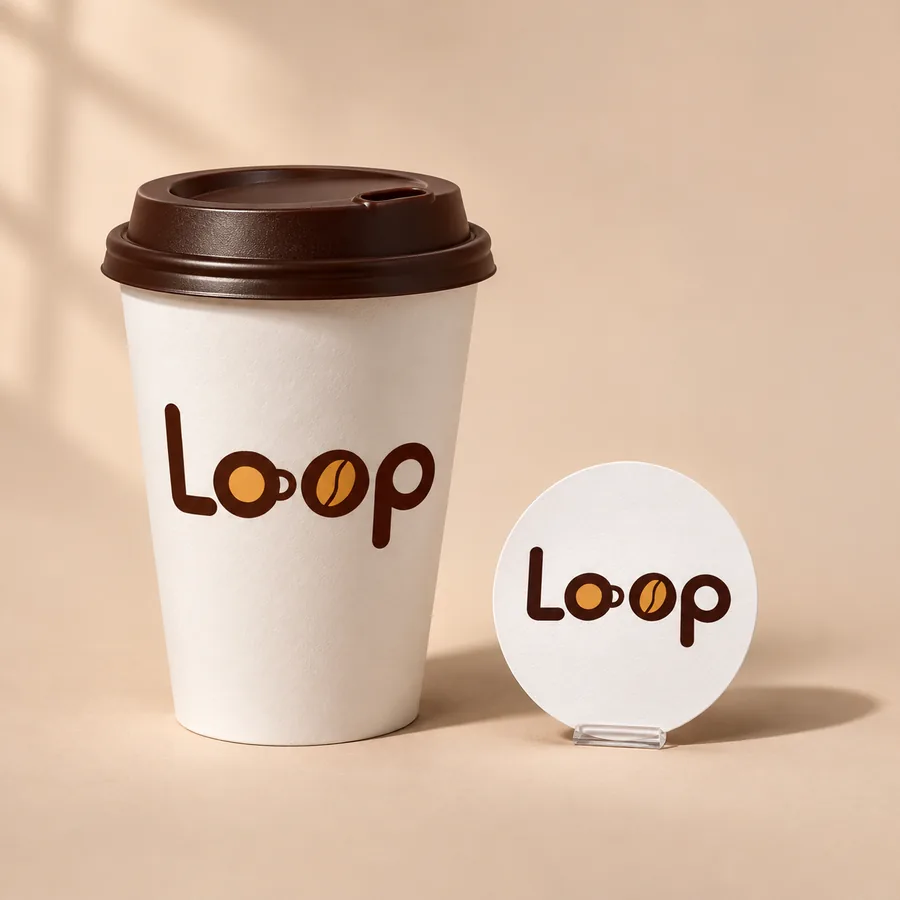
Colors look brighter on a backlit laptop screen than they do when printed with ink on unbleached kraft paper or dyed cotton fabric. Before ordering 500 coffee cups, tote bags, or embroidered hats, preview your logo on realistic surfaces and check three things:
- Contrast on dark and textured goods: Use your light-on-dark logo variant for black t-shirts, slate signage, and dark roast bags.
- Minimum stroke thickness for embroidery & stamps: Rubber stamps and embroidered polo shirts need clean, bold shapes without hairline gaps.
- 300 DPI print resolution: If your printer asks for raster artwork for Direct-to-Garment (DTG) apparel, use a 300 DPI transparent PNG rather than a 72 DPI web graphic.
5. Keep a one-page brand style guide handy
As soon as you hire a freelance web developer, a social media manager, or a packaging printer, they will ask for your exact hex codes, font names, and spacing rules. Having a Brand Identity Style Guide PDF (included automatically in our Brand kit plan) keeps everyone using the exact same shades, typefaces, and background rules from day one.